La Francesita
Bakery
Website Re-Design
September 2023
Tools
-
Figma
-
Miro
-
Trello
-
Adobe CC Suite
-
Google Drive
Team
-
5 UX Designers
-
1 UX Designer and Project Manager
My Roles
-
UX/UI Designer
-
developed the Unified Design Language
-
directed the RWD feature
Timeline
-
3 Weeks
We executed a comprehensive website redesign for a local business, engaging directly with the owner and customers. Using a mobile-first approach to optimize for desktop, mobile, and tablet.
La Francesita, located in The Woodlands TX, is a family owned French bakery that offers a taste and vibes of a Parisian Cafe within the local community.
As a team, we personally felt some of the frustrations surrounding visiting the bakery, which motivated us to work on this project.
Working with five teammates, we redesigned the website in a way that benefited the owner and the customers. I rebranded the site to align with the feel of the bakery. I also developed the Unified Design Language and directed the RWD feature.
The Problems
Being there physically to have breakfast several times, our lead researchers noticed that there were frustrations with customers struggling to get palmiers, La Francesita’s star item, and customers were leaving disappointed. At that moment, we knew we found a problem to solve, that could help the owner to grow her business and also the customers to have a better experience.
We approached Yaz, the owner and main stakeholder, to present the idea of the redesign. She was very excited, being a passionate business owner that had moved the bakery across continents. She knew she wanted to find a new way to deliver a better service because she was struggling being short staffed and not having a strong online presence or time to maintain it.
The original website was not an accurate reflection of the services they currently provided. You can see here in the hero image of the old website that they deliver and do curbside. Neither of which were currently being provided nor was there any intention to provide later. Also menu items were not accurate or digestible to read.

Research

9
26
1
6
Customer Interviews
Survey Responses
Stakeholder Interview
Hours of Observation
We put boots on the ground to find out what long-time and new customers wanted from the bakery.
Our research leads did an extensive initial interview with the stakeholder. This was followed throughout the project with more communication, keeping her updated on our ideas and getting feedback so we could make them best suited to her needs.
Results
Analyzing the wants and goals of our stakeholder and our customers, we were able to determine what we needed to fulfill.
-
Maintain the website to a minimal degree.
-
Find more staff.
-
Grow her business
-
To drive traffic to her website via the website and social media.
-
Be able to view the menu items online
-
A place to connect with their community
-
Quick & Efficient Service
-
Understand when limited items are available for purchase
-
To be transported to Paris without leaving the comfort of home.
The Sweet Spot
We labeled this intersection of goals The Sweet Spot.
With our sweet spot identified, it was easy to find main pain points for both the business and the customers:
-
La Francesita was not able to meet the customers’ demand for items.
-
Customers' confidence was lowered from the lack of visuals on the online menu, decreasing potential customers’ trust in the business.
-
Long wait times due to short staffing causing customers to choose to eat somewhere else.
Ideation

After getting the full perspective and point of view of users and stakeholders we created our User Persona Rick:
“I want to feel like I am in Paris without leaving home.”
Here’s an experience we could see our user, Rick, having before we got in the mix.

Heuristic Evaluation:
Our Main Takeaways
Aesthetics
-
Inconsistent colors, text, and grid
-
No real purpose for images
Navigation
-
Only 3 pages
-
No way to return Home from the header
Content
-
Lengthy menu that's difficult to absorb
-
Contact info is available on every page
Functionality
-
Hours are easy to find, but hard to understand
-
Email link is broken
Feature Prioritization Matrix
We visualized and prioritized features that users would value, were achievable for us, and aligned with our stakeholder's needs and ability to provide.

Design
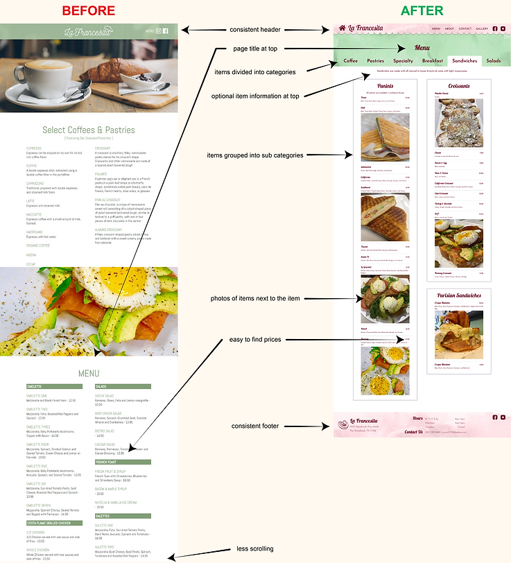
We started by tackling the Information Architecture.

The original design consisted of 3 pages: Home, Contact, and Menu.
We planned on adding a lot more to the site, but we wanted to keep navigation simple.
Added Pages
-
About
-
Gallery
-
Palmier Reservation Page that we promoted throughout the site
Added Features
-
Specialty Pastries section including when items are available
-
Now Hiring promotion and info
-
Testimonials
-
Displaying the bakery’s hashtag so customers could drive social media engagement without much effort from the owner
-
Instagram Feed
Improved Features
-
Menu is now broken into categories, making it much more digestible
-
Menu includes photos so customers can see what they’re ordering
-
On the homepage important information is prioritized
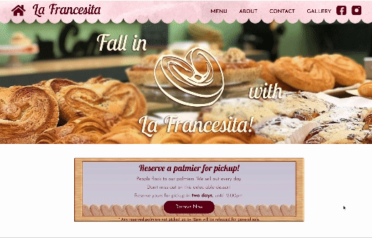
Solving the Palmier Problem
Since the Palmiers are the restaurant’s star items, we knew we had to fix the problem of customers not knowing if and when they were available.
We began by having the option to reserve Palmiers within the same day, but after discussing with the stakeholder, Yaz, we were informed that 2 days in advance would be best for the shop.
Style Guide

I put together a Style Guide for my team to work from. I wanted to create a website that helps foster the joy people feel with the bakery and captures the French vibe they’ve worked hard to create. Which is why you’ll see a lot of visual elements inspired by French cafes and joyful little microinteractions.
Responsive Website Design

There were some key elements we focused on with this build. A big one being breakpoints. We wanted a website that was responsive across multiple platforms and consistent throughout.
Prototyping
&Testing
Wireframes


We dove into wireframing and proceeded to implement the changes we'd discussed based on our heuristic evaluation.
The foundation of our wireframes were headers and footers that provided important info, displayed the bakery's name and enforced it's branding, and allowed for easy navigation of the site.
8
Usability Tests
Lo-Fi Testing
We wanted to understand how users would navigate and accomplish designated tasks to evaluate the process and features for the desktop and mobile version of the site.

Medium Fidelity
Mid-Fi was where we built out our features and refined our foundational elements.
Mid-Fi and A/B Testing
We tested new features, navigation, and accessibility items to find out how the updates affected the user experience, both positively and negatively.
We continued to adjust placement of icons, we made changes to the navigation to make it more intuitive, and we added multiple routes to find the page you’re looking for.
12
Usability Tests
A - 26
B - 56
Survey Results
Before & After

High Fidelity UI Walkthrough
Allow us to introduce you to La Francesita! And maybe tempt you to drop by if you're in the area. 😉
Conclusion
Problems & Setbacks
Some of our early solutions, like more involved social media integration, online ordering through the website or apps like Doordash, and curbside pick-up didn’t quite fit the owners’ needs. We also assumed that she would want to be more involved with maintaining the website. We had to pivot from these early assumptions to create a product that suited both the owner and her customers.
Next Steps for La Francesita
-
Spanish translations for the website and menu
-
Reward points program for loyal customers
-
Display for busy/high traffic times in the restaurant
-
Google maps pin for the address
-
Implementation of site changes with a developer
One Last Thing...
For front-end development, I coded a small piece inspired by this project with HTML, CSS, and JavaScript.