
APP CASE STUDY
JULY 2023
Tools
-
Figma
-
Miro
-
Canva
-
Zoom
-
Slack
Team
-
4 UX Designers
-
1 UX Designer and Project Manager
My Roles
-
UX Designer
-
UX Researcher
-
lead the creation of the UI Component Library
Timeline
-
3 Weeks
We designed an app to address food waste at home.
Working with my four teammates, we analyzed user data to create a user-friendly meal planning app focused on reducing food waste and decision fatigue.
In my role as UX Designer, I was an integral part of the research, ideation, build, and testing. I lead the creation of the UI Component Library.
I have a question for you.
Have you ever looked into your fridge, only to become frustrated when trying to decide what to make with the ingredients?
Have you ever felt discouraged by the unused food that often finds its way to the garbage?
All right,
Guess what?
Us too!
When our team was talking at the start of this project, something that we all had in common was the fact that we often let food go to waste. Despite a difference in household structure and lifestyle, we all had one common problem: food waste and meal planning burnout was a real thing.
As it turns out, it wasn't just us that had these frustrations. And we wanted to know why it was happening.

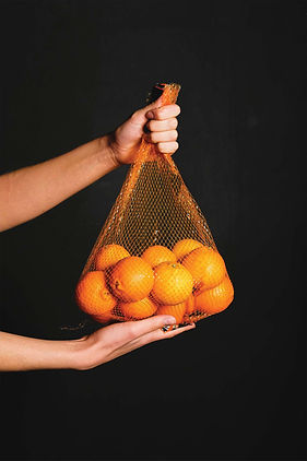
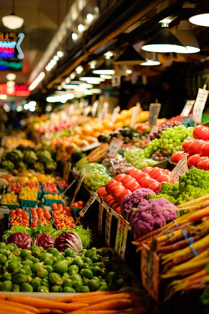
Often people buy food to cook at home
and it goes to waste.
"The average US household wastes 31% of the food that its members obtain"
- Yu & Jaenicke, 2020
Research
Our Hypothesis
We had an assumption of our users...
Food goes to waste because people don't know how to use ingredients creatively, forget what ingredients they have at home, or are optimistic about how they are going to use ingredients.
We wanted to understand our users
Research Methodology
Objectives
Understand how people manage their food at home and understand the challenges and pain points they face with managing food waste.
Audience
People who cook at home and are the primary person buying and cooking the food for themselves and/or their family.
People who feel like they are busy and have a lot of responsibilities to manage.
Method
10 Structured User Interviews
Online Survey Receiving 91 Responses
Field Dates
June 29-June 30, 2023
Ideation
With these interviews we found a lot of common patterns in our user's journey.
We found that the root of the problem is not that they are disorganized or don't know how to cook, but that they are busy and tired of making decisions about everything, including the meal planning process.
The lowest points of their journey were deciding what to prepare and throwing away ingredients they didn't use. These actions made them feel frustrated because they were wasting their money. So we wanted to focus on these two areas.

User Journey Map

Our North Star
"We believe that by providing our busy user with an easy and efficient way to prepare meals with ingredients they have will alleviate decision fatigue from their meal planning process"
Design
Now I'm going to walk you through Mary's journey using FoodCycle and take a closer look at our design choices.
Let's zoom out for a minute and look at what features FoodCycle has to offer.


Finding Recipes
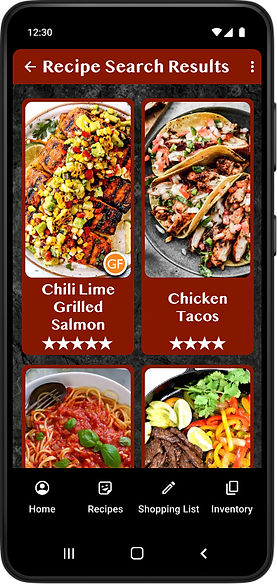
She can search for recipes based off what she currently has all the ingredients for.
She can search through recipes to include in future shopping and meals.

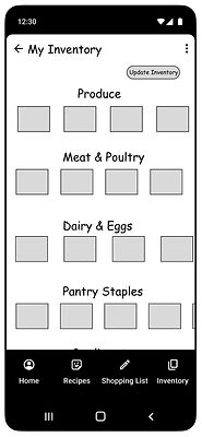
Managing Her Inventory
Mary can keep track of all the ingredients she currently has in her kitchen and will be informed what's close to expiring.
Creating A Shopping List
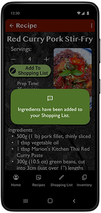
She can easily add ingredients from a recipe to her shopping list with a single click.
These features work together in a non-linear fashion to help Mary at multiple points in her food preparation cycle.
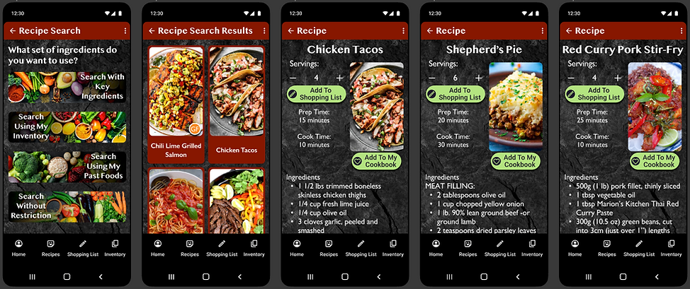
Deep Dive: Recipes
Mary can use our app in a couple key ways.

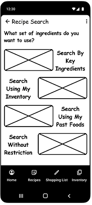
She can search for recipes prior to going shopping. The recipes can be tailored to the number of needed servings and auto populated to her shopping list.
Recipes can be filtered in multiple ways: Key Ingredients, Based on Inventory, Using Past Foods, and Without Restrictions.
This alone is enough to return results, which are capped at only showing 12 at a time to reduce choice paralysis.
Should those initial results not provide the recipes Mary is looking for, she has the option to set filters for dietary preferences and/or food allergies. She can also further narrow down her results using categories such as Dish, Cuisine, and even Holiday Recipes.
Deep Dive: Inventory
Similar to our recipe system, our inventory system gives Mary freedom to use it how it works best for her.

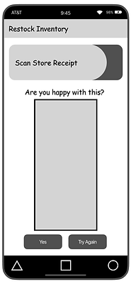
Mary can refresh her inventory by importing items from her online order or the app's shopping list. She can quickly and easily scan her store receipt, or she can even type in a few items to add individually.
After she cooks, she can remove ingredients from her inventory using the prepared recipe or manually in her inventory section of the app.

One of the key features of the inventory system is alerting Mary when food is about to expire so she can take action to head off waste in time.
Deep Dive: Shopping List
The shopping list is a simple tool for Mary to use when it comes time to go to the store. It is designed to bridge the gap between Mary's inventory and her cooking. It simplifies the process by auto populating the ingredients she needs based on her recipe choices. It also is useful for updating her inventory for future recipe searches.
Mary can easily add, remove, or edit items on her shopping list.

Prototyping
& Testing
Sketches and Lo-Fidelity
We sketched to get our ideas our of our head and on paper. We began experimenting with ideas and created the basic foundation architecture to build the app on. We built a low fidelity prototype to test.

Testing and Learning From Mistakes
The flaws in the design for our expiration reminder system quickly became apparent once we started testing. We had created a pop up system which wound up getting triggered far too often and annoying our testers.
We went back to the drawing board and re-envisioned how that feature should function. We kept a strong visual reminder using colors and prioritizing the items so they are seen first. We chose to allow the user to interact with the item on their own terms to see more details rather than the app forcing them to repeatedly interact with the pop up.

Mid-Fidelity


We built out features and introduced more interactions. We wanted to anticipate users' needs by suggesting recipes based on their past choices, we chose to put this on the homepage to drive engagement with the app. Thinking back to the north star of this project we prioritized the expiration tracker on the home page.
Testing
On top of the first round of tests, we ran 5 additional user tests on our mid-fi prototype. This yielded greater satisfaction with the app than before. We made some small changes, touching up our design with markers for gluten free and vegetarian recipes on the preview and changing wording to make navigation easier.


High-Fidelity
We applied branding that pulled deep rich colors from foods. Our photos of recipes were chosen to stimulate hunger, while our photos of ingredients on simple white backgrounds were chosen to feel clean and be easy to identify. We kept the visual feel dark, clean, and rich emulate the feel of an upscale restaurant.
FoodCycle:
A Clickable Prototype
Please watch as we take you on a short tour of our app.
Conclusion

The Future of FoodCycle
Our users will be able to edit the recipes in the app based on their personal dietary needs and taste preferences.
Implement a notification system for in-phone reminders tied to the app's expiration alerts.
And finally, we'd like to create a system using video and recognition systems to scan our user's pantry and fridge to add ingredients to their inventory.

What We Learned
We learned the importance of aligning major components of our app to a north star, or a central value, when working with a large group in order to stay focused and make sure that we are solving the user's problem.
