
Website Case Study
November 2023
Tools
-
Figma
-
Adobe CC Suite
-
Google Drive
-
Zoom
-
Slack
Team
-
5 UX Designers
-
1 UX Designer and Project Manager
My Roles
-
UX/UI Designer
-
conceptualized the Interaction Design elements
-
established the Unified Design Language
Timeline
-
3 Weeks
We transformed the crochet learning experience by applying LLMs to develop intuitive cross-platform interfaces for a smooth multi-device experience.
Incorporating AI technology in an innovative and ethical way, we filled a gap in the process of learning to crochet while working with artisans to respect their art.
We factored in many elements including initial learning, refining skills, staying motivated, keeping inspired, and formulated a business and marketing plan.
I played a pivotal role by conceptualizing the Interaction Design elements and establishing the Unified Design Language.
Many people put off learning a new hobby simply because they don't have someone to guide or teach them the new skill.
Despite the many resources available online, many people felt unsure of where to start.
We started looking into what people need and how we could leverage generative AI to provide it.
Research
Research
When looking at our competition, we noted that many sites had plenty of tutorials and patterns available. Despite there being several ways to learn how to crochet using technology…
We wanted to find a way to set ourselves apart.
YouTube, Easy Crochet, and Skillshare are all good resources, yet they lack one key component:
A teacher.
Competitive Analysis
9 Interviews
26 Survey Responses
Through our research we found that 50% had a beginner skill level and that 46% of the users were young adults between the ages of 25-34.
From our interviews we learned that people typically learn crochet from a family member, but once they are left on their own they struggle to maintain the hobby.
These insights lead us to design a tool that is attractive to young adults and will help them stick with their new hobby.
Results
Ideation
Ideation
-
time wasted trying to find specific help from long online videos
-
importance of having a visual pattern
-
getting bored or discouraged and quitting projects
-
sought after solutions were frequently reactive and lacked real-time troubleshooting
Pains
-
feeling of accomplishment
-
tangible item
-
stress relieving act
-
cost efficient gifts
Gains
We used our research to create an affinity diagram,
finding 9 different categories that helped us shape our site.
User Personas
Jennie
From our insights, Jennie was created. She is an interior designer who wants to add special personal touches to her and her client's spaces. She's interested in learning to crochet to help her meet this need.


Onyx
Since our AI teacher is such a vital part, we wanted to flesh out their personality as well.
Onyx takes great pleasure from being helpful and encouraging. They like being asked questions and take initiative to check in along the way.
We used an Empathy Map, the I Like, I Wish, What If method, and Prioritization Matrix to bring us through the rest of the journey to the Value Proposition Canvas, making sure we addressed what was important to our users and the business.

Since the learning method we want to provide is unfamiliar, we wanted to start by offering a sample for free. This would include some basic patterns and a basic course to learn how to crochet. Our hope is that this would allow users to become comfortable with our product and also eliminate lack of crocheting knowledge as an impediment to using our site.
Offering a free intro is an effective strategy used by businesses across many fields.
Once users are ready to progress further, they can purchase individual bundles of designs. All the designs in a bundle are curated and come with unlimited assistance from Onyx. They never expire and once a customer owns them, they own them.
What's for sale?
We understand how pivotal social media is in driving sales and thought we could kill two birds with one stone by combining social media marketing with enhancing the users sense of accomplishment.
We designed and promoted badges that the users could earn from completing projects. Sharing these on a user's social media accounts should result in positive feedback from peers and exposure for our site.
Marketing
As part of our brainstorming, we considered how the business model for this site would work.
Design
Design
When researching other sites, I noticed that the more modern sites all had a high level of Interaction Design. I felt it was unwise to start with a static design and only add in movement at the very final stages. So I pushed my team to start thinking about how to incorporate movement early. A key element was dialing in just the right amount of animation and whimsy so that it wasn’t overwhelming or confusing, yet still created delight. It was important we start incorporating that early so we could get feedback from user testing. Thankfully, my team was onboard with this idea.

Card Sorting
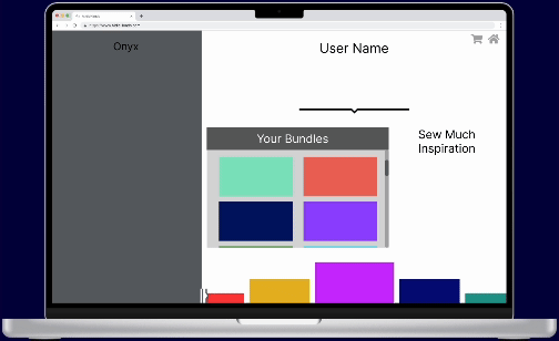
We started laying the framework with card sorting. Here we decided what pages would exist and how the features we wanted to implement would be incorporated. Though we had few pages, this helped add functionality to the site while still not taking away from the main AI interaction.
Style Guide
Colors
I used colors and imagery to evoke the feeling of a cold dreary day and a soft glow, inspiring the user to stay inside and craft. I pulled from the way lights shown through rain-streaked windows and images of Tokyo's neon lights on a rainy day.

Icons
You can see the influence of the neon lights in the icon choices. I picked rounded line icons and gave them a glow.

Typography
For the title font, I went with a cursive with a variable baseline, this gives it a classic feel with a bit of a chaotic twist. I balanced this by using it sparingly and combining it with other cleaner fonts.


Logo
In designing the logo, I wanted a slightly witchy occult feel. Something clever and cute. As a bonus, I got a good laugh out of having hands as the logo on an AI heavy site while I was drawing them.
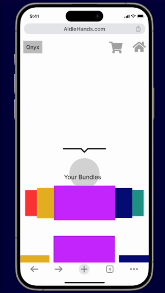
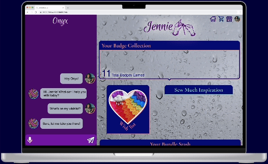
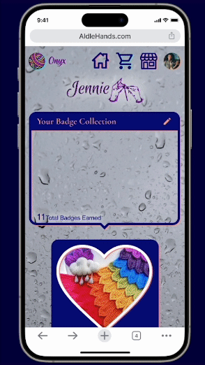
Onyx is a LLM designed to help you learn, guide you while working, and keep track of and find new projects.
It uses speech-to-text to provide broader accessibility and hands-free access.
Many users who were interviewed were taught by their grandmothers, and we wanted to inject that love and care into Onyx. We understand that learning a new skill, especially a tactile one, can be frustrating initially. Thus our AI uses encouraging and positive language to motivate a new user to keep up with the craft.
As iterations of A.IdleHands were expanded upon during testing, our AI was consistently praised for how gentle and encouraging they were to the user, letting us know that we were successful.
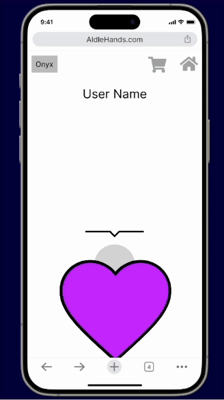
In addition, users can navigate the entire site through Onyx. Review their badges, update the projects they’re working on, and much more can be done by communicating with Onyx.
Introducing You To Onyx
Prototyping & Testing
Prototyping & Testing
To illustrate my process, I want to walk you through the evolution of one page.
Wireframes
As you can see, we started with arrows and notes on the wireframes to address movement.
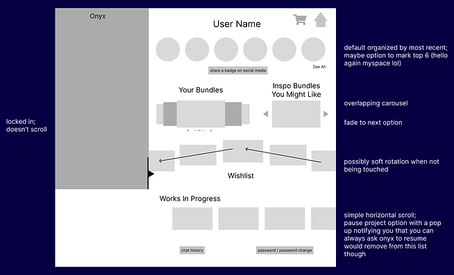

Mid-Fi
We moved forward with implementing our animations in order to start testing. Out of necessity. we had to incorporate color, but we were careful to not set any expectations for the final color palette.

Internal Iterations
When we began designing, we organized pages that contained multiple blocks of information with common elements like carousels and scrolling features. Based on early feedback and more critical evaluations on our part, we heavily iterated the mid-fi. We imagined ways to achieve the same or improved accessibility while engaging the user better.
We rolled out these changes for our second round of tests.

In our mid-fi testing plan, we focused on user navigation. Could our testers complete the tasks assigned? What was intuitive and what was difficult to understand?
We received some eye-opening results. We learned quickly that we needed to label and explain more than we’d initially thought.

Mid-Fi Testing Results
Hi-Fi
We combined our mid-fi testing results, our style guide, and further refined the reimagined organizational structures and animations as we transitions to our hi-fi prototype.

Our hi-fi testing plan focused not just on the ease of successfully completing tasks, but also how users could transition back and forth between interacting with Onyx and navigating the rest of the site. We asked questions specifically about their feelings surrounding the animations.


Hi-Fi Testing Results
Hi-Fi Iterations
All this we put towards some final tweaking, such as adding badge drop down to also be accessed from tapping the users total number of badges, clearer labeling, and increased color accessibility.

A.IdleHands Final Prototype
Conclusion
Conclusion
Knots to Untangle
Figuring out how to smartly and ethically incorporate AI into our concept was a challenge we were excited to tackle. In the beginning we considered using it to generate patterns or to modify patterns to use available supplies. But these options leave a lot of room for AI to fail and lack the respect to artisans we wanted to show. Pivoting to using LLM AI as a knowledgeable and friendly guide was our Eureka moment. We all instantly fell in love with it and eventually with Onyx.
Next Stitches
-
We decided to build web pages, but from the start we knew it would be best to expand into a companion app down the line.
-
Social media is a big part of A.IdleHands, we'd love to take our use of it further by creating even more of a tight-knit community through increased social connections.
-
Expansion into other yarn art practices, such as knitting.
-
Coming up with more yarn puns!